The Potabo brand kit, ready to download.
This page is for anyone writing about Potabo, showing us in a talk or building an integration. Every file here is generated from the same logo the website itself wears, and every colour is exactly what the stylesheet holds. You do not need to ask us before using any of it.
We are happy to answer questions about usage. The address is further down.
What you can write about us.
Three lengths, so you do not have to rewrite anything. Copy whichever one fits your piece.
One sentence
Potabo is storage management for potato farms: crates, big bags and bulk goods are recorded from a phone, and the office sees the stock in real time.
Short version, around 50 words
Potabo maps the potato store digitally. Whoever moves something in the store records it straight from a phone, and the stock in the office is current the same moment. Crates, big bags and bulk goods live in one system, together with orders and figures. The paper trail between hall and desk disappears.
Long version, around 100 words
Potabo is storage management for potato farms. It maps what is actually in the store: every crate, every big bag, every batch of bulk goods, with variety, origin and condition. Recording happens where the goods are moved, from a phone, without the detour through a piece of paper. The office sees current stock the same moment, and orders, put-away, retrieval and the figures behind them live in one system instead of four. Potabo comes from the potato industry and is built together with farms that store their own crop. The company is based in Germany.
- Name
- Potabo
- Spelling
- Potabo, with a capital P. Never POTABO, never potabo in running text.
- What it is
- Storage management for potato farms
- Based in
- Germany
- Website
- potabo.de
Logo and wordmark.
The lockup is the default form. Use it wherever there is room for it. Switch the preview to dark to see how the cut out files sit on your own background.

Logo Black on a transparent background
The default. Use it on white and on any light surface.

Logo White on a transparent background
For dark surfaces and over photography that stays dark behind the mark.
Logo White on Potabo Red
The signature lockup. Reach for it when the logo is the whole graphic.
Logo Black on white
A finished tile for print and for anywhere a transparent file is awkward.
Logo White on Potabo Black
A finished tile for a dark deck, already carrying its own margin.
SVG is always the right choice unless something speaks against it. It stays sharp at any size and is the smallest of the three files.
The symbol on its own.
For everywhere the lockup is too wide: as a profile picture, as a favicon, as a marker on a map. The symbol never stands next to the lockup, it replaces it.
Symbol Black on a transparent background
The symbol on its own, for light surfaces where the wordmark does not fit.
Symbol White on a transparent background
The symbol on its own, for dark surfaces.
Symbol Red on a transparent background
Only where the surface is neutral enough that the red still reads.
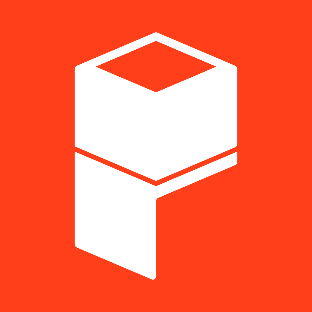
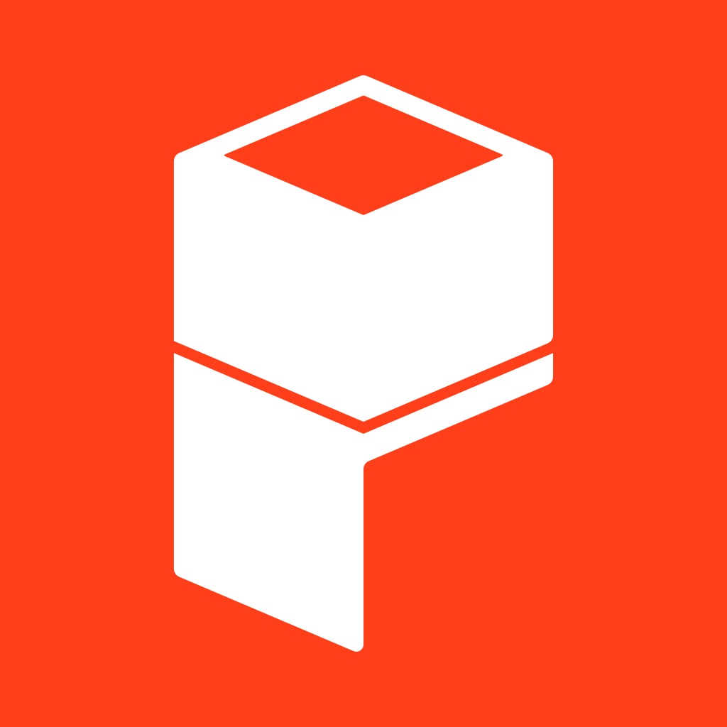
Symbol White on Potabo Red
The avatar version. This is the one to hand a social profile.
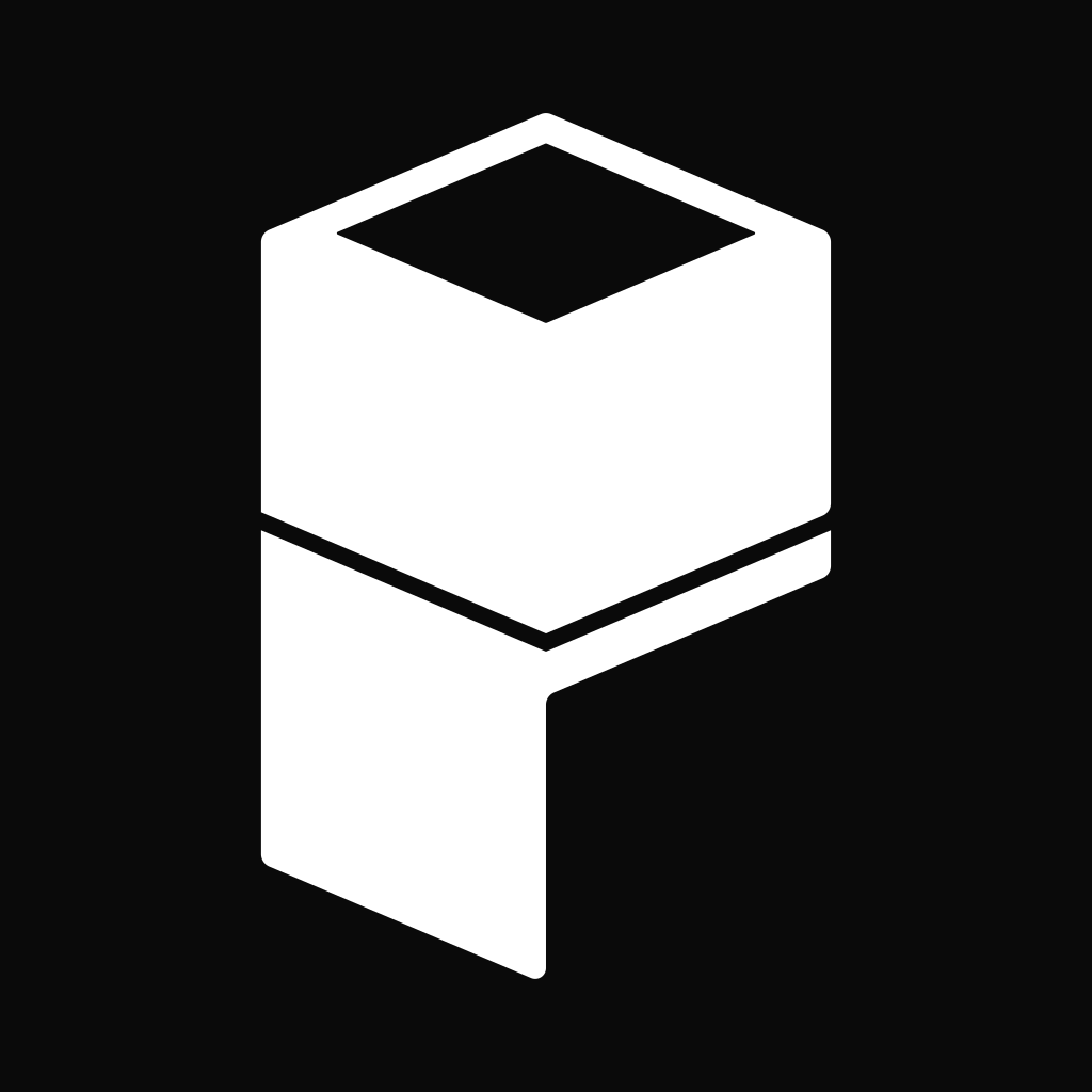
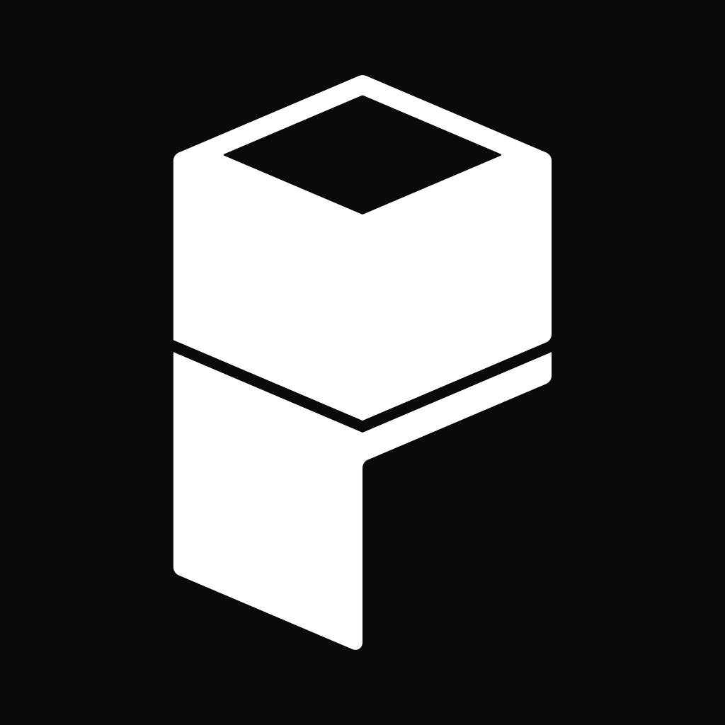
Symbol White on Potabo Black
A square tile for a dark layout.
Symbol Black on white
A square tile for a light layout.
App icon and favicon.
Two files that look almost the same and are not. The app icon has air around the symbol, because a home screen needs it. The favicon has almost none, because a browser tab squeezes it down to 16 pixels.
App icon
The icon as the app stores show it. 1024px, already rounded for macOS. iOS and Android round the square themselves, so hand them this file as it is.
App icon, black
The alternate tile, for a home screen or a docs sidebar the red would shout on.
Favicon
What a browser tab shows. Padded far less than the app icon on purpose: at 16px every pixel of margin is a pixel the outline loses.
The palette.
Every value here is exactly what the site stylesheet holds. Clicking the hex copies it.
Brand colours
The red is the identity and never an interface colour. The blue is the only chromatic colour in the interface. The amber appears only inside the gradient, alongside the red.
Potabo Red
The identity colour. It carries the logo, the gradient field behind a signature section and the bar under the share card. It is never a button fill and never a background for body copy.
- Token
- --potabored
Potabo Accent
The one chromatic colour in the interface: the accent button, focus rings, inline links, section eyebrows. It lifts on the dark canvas so it keeps its contrast.
- Token
- --brand
- Dark
- #628af8
Core colours
Black and white swap roles between light and dark mode. The grey between them carries everything that reads below the headline.
Potabo Black
Body copy and headlines on the light canvas, and the canvas itself in dark mode. Also the fill of the default button, inverted against its label.
- Token
- --foreground
- Dark
- #fafafa
Potabo White
The page canvas in light mode, and the colour type sits in on the black one.
- Token
- --background
- Dark
- #0a0a0a
Muted Foreground
Intro paragraphs, captions, meta lines. Everything that reads below the headline.
- Token
- --muted-foreground
- Dark
- #a1a1a1
Surfaces and lines
Secondary Surface
The subtle grey a section alternates to so two neighbouring bands stay apart, and the fill of the secondary button.
- Token
- --secondary
- Dark
- #262626
Border
Card outlines, dividers and input borders. On the dark canvas it is white at ten percent rather than a grey, so it stays even over whatever surface is under it.
- Token
- --border
- Dark
- rgba(255, 255, 255, 0.1)
Signal colours
These three mean something and are never used decoratively. The alert red is deliberately not the Potabo Red: a warning that looks like the logo teaches people to ignore both.
Destructive
Errors and irreversible actions, and nothing else. It is deliberately not the Potabo Red: a warning that looks like the logo teaches people to ignore both.
- Token
- --destructive
- Dark
- #ff6669
Success
A confirmed action or a healthy state.
- Token
- --success
Warning
Something pending, or a state that wants attention without being wrong yet.
- Token
- --warning
Chart colours
Five series, chosen differently for light and dark mode so each series keeps enough contrast on its own ground.
Chart 1
First series in a chart.
- Token
- --chart-1
- Dark
- #1447e6
Chart 2
Second series.
- Token
- --chart-2
- Dark
- #00bd7d
Chart 3
Third series.
- Token
- --chart-3
- Dark
- #ff9b00
Chart 4
Fourth series.
- Token
- --chart-4
- Dark
- #ad47ff
Chart 5
Fifth series.
- Token
- --chart-5
- Dark
- #ff1f56
One typeface, eight steps.
The site sets everything in a single family. The steps below are exactly the ones in the stylesheet, and each is set here at its own size.
- Inter 400Body copy
- Inter 500Labels, buttons
- Inter 600Headlines
Inter 36 / 48 / 60 px
The one h1 a page opens with. Set tight, and balanced so it never leaves a short last line.
Inter 30 / 36 px
The h2 that opens a section.
Inter 18 px
The h3 on a card in a grid.
Inter 18 px
The paragraph under a section heading, set in the muted foreground.
Inter 16 px
Running copy in an article or a long block of text.
Inter 14 px
Card copy, list items, form help.
Inter 12 px
The kicker above a headline, set in the accent. It is the section name, and the nav says the same word.
Inter 14 px
Numbers that have to line up, codes, and anything technical.
How round a corner is.
One base value, with three steps derived from it. The two ends of the scale are defaults and do not move when the base value changes.
Full bleed media, and anything that meets the edge of the viewport.
Buttons and inputs. A Tailwind default, so it holds at 4px whatever --radius becomes.
Badges and inline pills. Derived: calc(var(--radius) minus 4px).
Icon tiles and the smaller panels inside a card. Derived: calc(var(--radius) minus 2px).
The base value, var(--radius) itself. Dropdowns, dialogs, sheets.
Cards and the larger panels a section is built from. Also a Tailwind default.
Avatars, status dots and circular icon buttons.
Seven variants, one ranking.
The most important action is neutral and dark, not coloured. Colour is reserved for the rare action that has to outrank everything around it, and for the one that cannot be undone.
The main action in a context. A neutral high contrast solid, so colour stays meaningful.
Opt in emphasis, for the rare action that has to outrank a neutral default.
The second action next to a default. Cancel, view, export.
Lower contrast tertiary actions, and grouped controls.
Contextual and icon triggers that should not carry button chrome until hovered.
Only for something that cannot be undone.
A navigation style action with no chrome at all.
The gradient field.
On the site this field drifts slowly. Here it is a still of the same composition, computed from the same source. White type sits on it directly, and nothing else does.










JPG is the smaller file here. The grain is part of the picture and PNG can barely compress it.
Product shots.
Screenshots in a frame, for articles and talks. The frame is drawn rather than photographed, so it always matches the current interface.
Storage plan in the browser
The view from the desk: which bay is occupied and what is in it.
potabo-lagerplan-1.webp
Crate tracking on a phone
What happens in the store is recorded where it happens.
potabo-idee-3.webp
Batch overview
Variety, origin and condition per batch, across the whole store.
potabo-lagerplan-3.webp
What you may do, and what you may not.
In short: use the files as they are. Anything you would change about the logo is the part we are asking you to leave alone.
Use it without asking
In articles, talks, comparisons and integrations. You do not need our approval.
Leave it room
Keep at least the height of the symbol clear on every side. The files with a background already bring that margin with them.
Do not recolour it
The logo exists in black, in white and in Potabo Red. A fourth colour is no longer a Potabo logo.
Do not stretch it or rebuild it
Do not stretch it, rotate it, add a shadow to it or redraw it. Scale the SVG file and everything stays right.
Not sure whether your case is covered? Drop us a line, we answer quickly.
Something missing?
If you need a file, a format or a figure that is not here, tell us. We will put it on this page so the next person finds it straight away.